These days, it seems that you can spend countless hours researching different strategies or rules you must follow when creating, improving, and/or modernizing your application’s UI/UX (User Interface/User Experience).
Several times I have found myself digging in to what I need to do to improve, but at the end of the day I am more confused than enlightened.
Whether you’re creating a new application, or modernizing an existing one, focusing on a few simple elements can greatly improve an application’s UI without requiring a ton of time.
Here are four straightforward things you can do to improve your application’s UI:
You have a DB for that!
#1 – Use an autocomplete.
If you’re not 100% sure what an autocomplete is, the Wikipedia definitions goes as follows:
“Autocomplete, or word completion, is a feature in which an application predicts the rest of a word a user is typing. In graphical user interfaces, users can typically press the tab key to accept a suggestion or the down arrow key to accept one of several.
Autocomplete speeds up human-computer interactions when it correctly predicts the word a user intends to enter after only a few characters have been typed into a text input field.”
The advantage to using an autocomplete in your UI is right in the Wikipedia definition: “Autocomplete speeds up human-computer interactions”!

So the next time you have a text input in an application where you might have a database, file, API, or another resource that can provide a list of entries, let’s give the user options. Not only does this improve usability, but it helps with maintainability. It’s easier to maintain one DB or file than several hard-coded inputs or HTML select statements.
Yes, no, maybe so?
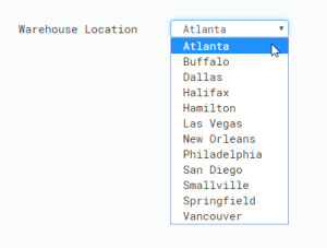
#2 – Not that many options? Use a drop down!
Along the same lines of using an autocomplete, a dropdown is a great element to give the users a list of available options. Not only does a dropdown show the user the available options for an input, it acts as a method of client-side validation by limiting a user to select a predefined option, rather than manually typing it in into a text field.

I see this a lot specifically when modernizing green screen applications with Presto. Take those text fields, use a DB, API, list, etc.. and simply create a dropdown! It speeds up the user-computer interaction while protecting against user input error. Double win!

Warning: If your list of options is too large, don’t use a dropdown. No user wants to be overwhelmed by an exorbitant amount of options. My rule of thumb is about 20-30 options (unless the list is universally known, like a list of states). If you find you have to many options you might consider an autocomplete! Hey, where did I read recently read about those?
Where the mouse ends up, navigate!
#3 – Action buttons (back, forward, cancel, do something…)
Action buttons simplify and clarify the flow of your application. How many times have you filled out a form on a web application and when you got to the last input on the page you thought to yourself, “Now what?” This is where a well-placed and simply labeled button can make the difference.

Cancel, Back and Continue are all simple examples that give your user a hint on what to do next. Don’t leave them stranded!
E.T. go home!
#4 – If possible, give your application a Home, Cancel, or Return button/link.
If a user is not sure what they did (and this happens a lot), they will want to go back to the start. Typically a global Home button at the top of the application will do the trick.
If you are modernizing or refacing a green screen application, this might not be completely possible. In this situation, having a well-placed Cancel, Return or Exit button can have the same effect so the user can work their way back.
The main point here is don’t leave folks stranded.
Start by implementing these tips in one application, and you will see, and hear, the difference from your users.
Stay tuned for more tips coming at you. If you have any modernization questions or topics that you would like me to touch on, please let me know!


